Rewire Neuro
Reimagining the Rewire Neuro website experience to increase sign ups
AI to Help the Medical Community
Rewire Neuro is a startup located in Portland, Oregon that specializes in AI products to help the medical community. Their latest product, Pipsqueak, had just launched and they were looking for our team to redesign their current website to promote their full offerings and help increase conversion of visitors. Our focus for this two month contract was to understand why users weren’t converting and start the redesign process of the most priority areas - homepage, product comparison, and checking out.
Goals
Boost product comprehension
Simplify product comparison
Increase traffic and conversion
Reduce hurdles to activate trial
Key Design Elements
Home page
Navigation
Product comparison
Check out
Sign up for trial
Outcomes
Website designs for key pages
Updated design library
Revamped look & feel
User feedback consolidated
Current User Experience
To set the foundation for our redesign, the team set to conduct a variety of research activities centered on understanding current usability and understanding user needs. Overall, we found that users were confused by the different product offerings and often were dropping off because of this confusion.
Research planSite Audit
Usability Testing of Current Website
HotJar Web Traffic Analysis
Methodology
Research Goals
Understand pain points of current site
Highlight opportunities for improvements
Define top areas for revision
SITE AUDIT FINDINGSUSER TEST FINDINGSUser Needs
Reliability & credibility
Quick learning curve
Compatibility with existing software
Pain Points
Unclear differences between products
Compatibility confusion
Confusing relationship between Pipsqueak & Rewire
Recommendations
Emphasize publications & testimonials
Market ease of use
Showcase available tutorials
Emphasize value prompts ex. faster results, compatibility etc.
Provide dedicated product comparison page
Ensure similar look across pages and clearly describe relationship between products
Defining What Will Bring Value
Post research, the team came together to align and agree on redesign priorities. We utilized a “how might we” matrix to compare value and impact to both users & the business.
This would direct which screens/flows would be redesigned in this first phase, and which screens/flows would wait until a future phase.
We also defined scope of the redesign to the homepage, compare product, & checkout flow.
HOW MIGHT WE eXERCISEMapping Out Priority Pages
Now that we had researched pain points and defined our goals, we were able to create a site map of website content, particularly paying attention to how the user would compare products and checkout.
site mapNew User Experience
The team then used the site maps, research, and redesign priorities to create user flows, wireframes an interactive prototype. Due to time constraints and it being the first phase of the contract, the team decided mid-fi wireframes would serve the purpose we needed in order to be able to conduct testing and provide feedback to client.
User FlowsWireframes / PROTOTYPETesting Our Redesign
To test our redesign, we conducted another round of usability testing with the new screens. We conducted 5 tests via Zoom and had users attempt to explore & checkout one of the products. We were mainly interested in seeing if users could better compare the product differences and if checkout was easier than before.
Test Goals
To test the different pages of wireframes to check for ease of flow, understanding of the products and final checkout to make a purchase.
User Tasks
Identifying the available products
Compare the available products to find the best option for their lab
Learn more about Pipsqueak Pro through the publications and FAQs
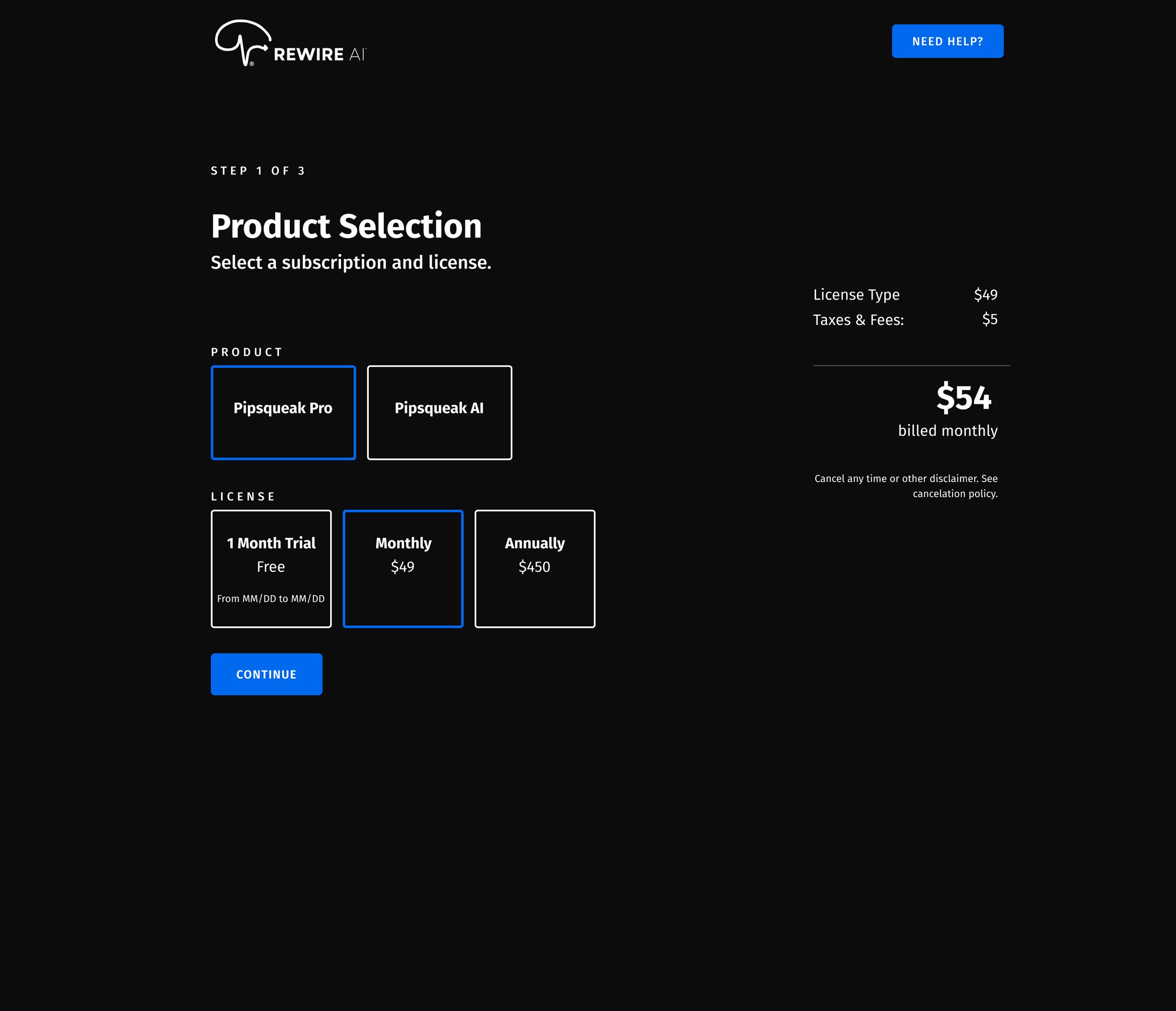
Signing up for the Pipsqueak Pro 1-month trial and checking out
Refining, Improving & Validating
After our usability testing, we transformed our mid-fidelity wireframes to high-fidelity designs while incorporating priority revisions from our test findings as well.
Revision #1
Insight: Some users missed the product section so there was still confusion on why products weren’t communicated more on the homepage.
Recommendation: Make product section more pronounced / higher on the page
Revision #2
Insight: There was no trial end date listed, causing confusion on when it would expire
Recommendation: Include trial end date and what happens post-trial
Reflecting on a Collaborative Challenge
Having not worked yet in the biotech space, there was a lot of industry knowledge we had to gain context around quickly. Plus working in partnership with multiple UX researchers & designers, it took awhile for us to get a solid process down as we were all used to different methods and environments. However, we were able to make a plan and follow through due to the strengths and dedication of the team.
As for implementing the redesign, this was phase 1 of the redesign process and an internal team was going to take over on actually bringing changes live. I’m excited to see the updated version coming live soon!


