Earth Hero
Building a new community feature to empower climate activists

Acting on Climate Change
Earth Hero is a mobile app with a mission to make it easy to act on climate change. With over 40,000 downloads to date, the app allows users to perform various tasks on their journey to help fight climate change.
Our goal was to design a new community feature to increase user engagement and retention. The team consisted of designers (my role: a co-lead designer), researchers, product strategists, & engineers. In general, I learned how to collaborate with a group of designers and the importance of communicating across teams when priorities and timelines change.
Goals
Design community feature
Motivate users to complete climate actions
Increase user engagement
Increase user retention
Key Design Elements
Group dashboard
Progress visualization
Activity feed
Invite members
Outcomes
Design & development prototypes delivered
Success criteria defined
User value confirmed
Client approved direction
The Vision
A friendly place for people to engage with family, friends, and like-minded individuals, manage their actions as a group and encourage each other to accelerate climate action.

Understanding User Behaviors & Goals
To set the framework for our design process, the design team collaborated closely with the research team to understand user goals and how best to create an environment that could encourage engagement and usage of the feature.
-
• Learn how other groups are structured and managed on apps
• Discover ways to engage and retain group members
• Highlight features that would excite group managers and members
• Understand what barriers exist for engaging in groups
-
Competitive analysis
Google Analytics
User interviews
-
Users want to…
Customize and organize groups
Learn about the group when joining
Communicate both individually and as a group
Invite members easily via email, code or link
Set roles for group members
Add personality and customization to profile
-
How users are engaged within groups…
Supportive environment – members want to feel welcomed and sense of community & common purpose
Users are motivated by group norms & positive peer pressure
Communication (open and/or facilitated) is key
Members that are learning from other members are more likely to stay

The Challenge of Defining Priorities
With research complete, the design team collaborated closely with the strategy, research, development and client teams to define what would be included in the first iteration of the community feature and bring the most value. This was the hardest and most time consuming part of the project as we had so many perspectives and questions to consider at this stage.
As a result, it took the team awhile to get all in alignment on the decided direction (balancing creativeness with feasibility was a top concern). We also updated our roadmap on these decisions.
Sprint Planning
scopeCreate a group
Group name
Admin name
Group description
Photo
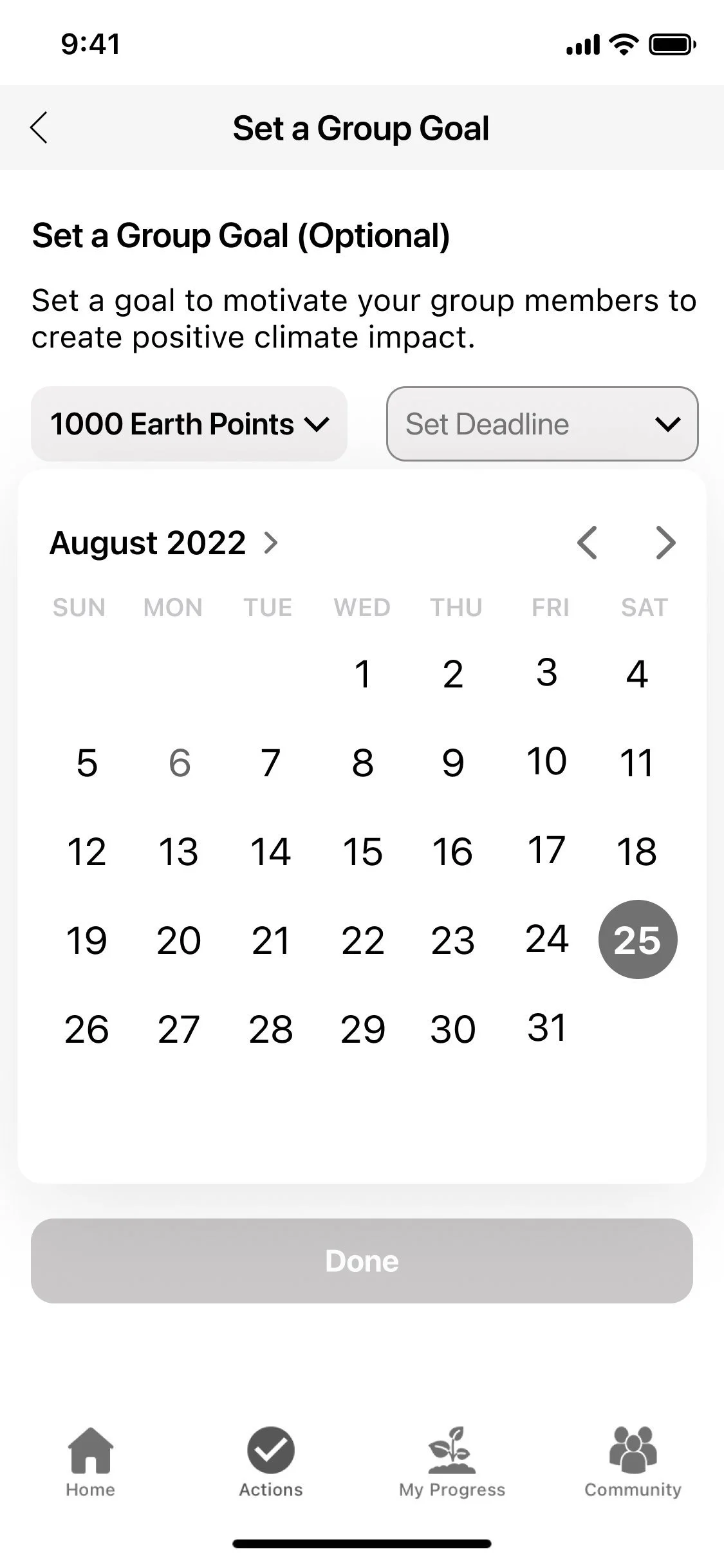
Set a goal
Invite members
Dashboard
View other members
Progress
Data visualization
Feed
Onboarding
View/add members
Create Goal
Check Progress
Mapping out the Community Feature
Now that we knew what would be prioritized in the community feature, the design team set to understand at a high level how content of the community feature would be organized as well as how the community feature would interact with existing personal progress components of the app.

Bringing the Feature to Life
The design team then set out to bring the community feature to life through user flows and wireframes. Flows helped us define which screens we needed and how both the admins/members would interact with the groups. Wireframes helped us visualize and communicate our proposed design solutions. At this stage, we showcased our proposed ideas to the client and development team to ensure alignment and feasibility.

Member Flow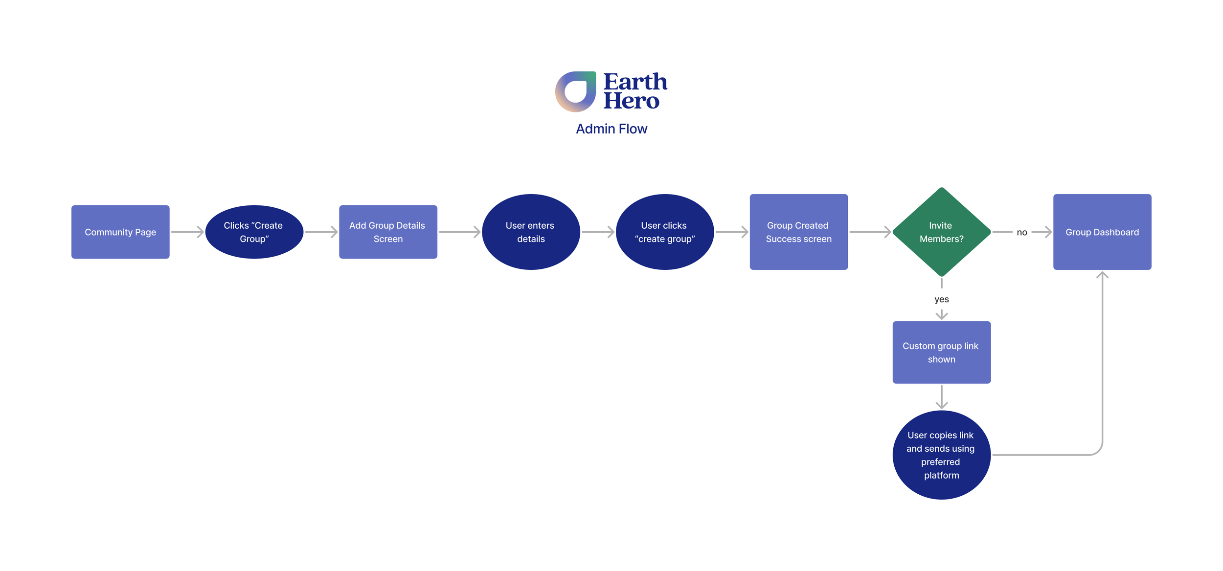
Admin Flow-
![]()
✶ User pain point: Users want to know how to engage with group when joining
✶ Design solution: Interactive onboarding to show and highlight the community feature portal
-
![]()
✶ User pain point: Communication and group activity can get easily lost quickly if there’s a large group
✶ Design solution: Group feature is organized in three main areas: progress, actions & feed which allows user to see what matters most to them quickly
-
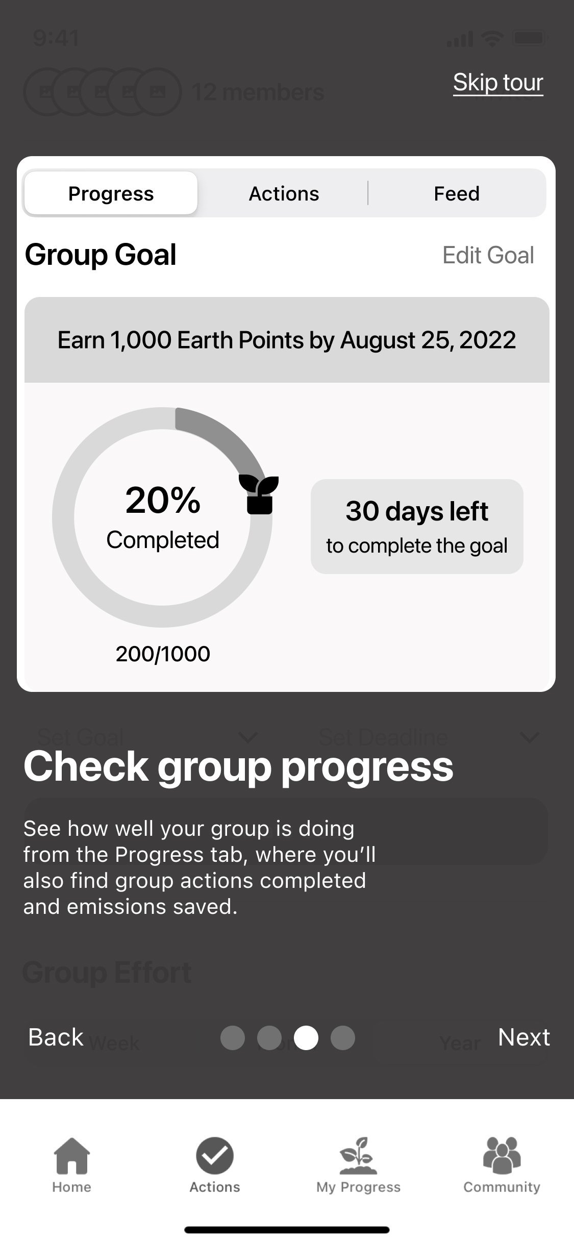
![]()
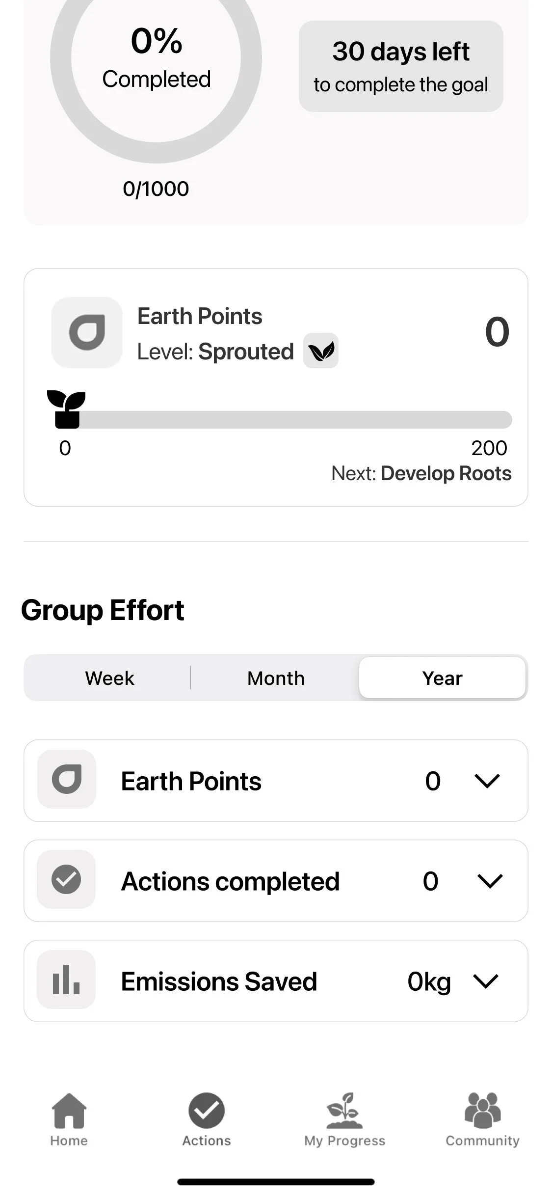
✶ User pain point: Staying motivated and understanding progress can be hard
✶ Design solution: Group admins and members can see progress collectively as well as activity, which allows for positive peer pressure to complete actions
-
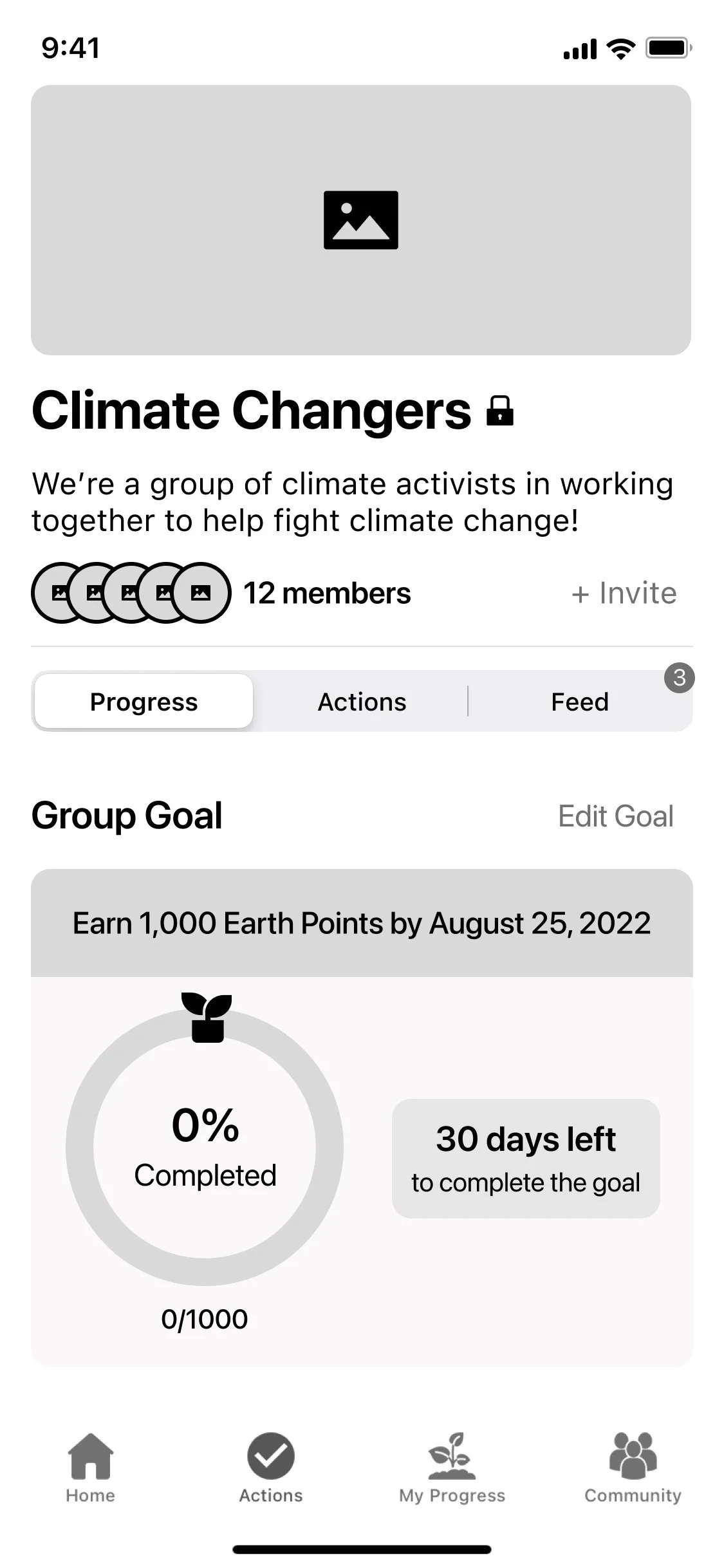
![]()
✶ User pain point: Staying motivated and understanding progress can be hard
✶ Design solution: Group admins and members can see progress collectively as well as activity, which allows for positive peer pressure to complete actions
Updating & Utilizing the Design Libray
As we were designing, we were mindful to refer to and complement the existing Earth Hero design library. To ensure consistency, we made sure to repurpose existing components where fitting and any new components, text styles or colors we created had to be cohesive with the existing system.

Validating the Initial Solution through User Testing
With wireframes and a prototype created, we collaborated again with the research team to conduct usability testing to gather feedback and understand which iterations would improve our existing designs. For this usability test, we tested with current Earth Hero users and focused on the group creation process.
Test Goals
Highlight confusion areas of creating a group
Observe any areas of confusion, hesitation or difficulty
Learn which areas of the feature need more context or education
Explore ways to improve the layout and content
Test Findings
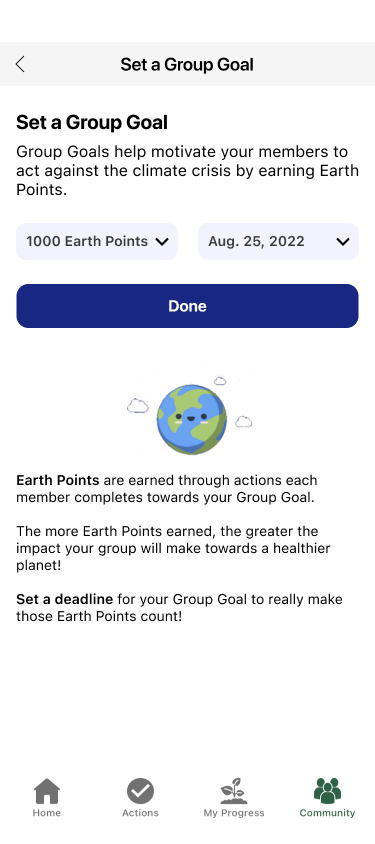
Earth Points: Confusion what they are and how they work
Group Creation: Confusion on requirements & “invite” link easily missed
Onboarding: Users expected it to be interactive / clickable
Goal Setting: Confusion how Earth Points are integrated into goal
Improving Problem Areas
From usability testing, we were able to define a clear list of iterations. We brainstormed as a design team ways we could improve the problem areas and also took time to move our designs from a mid-fi state to a high-fi state and also looped in the development team on the changes we planned on making.

Revision #1
Insight: Confusion what earth points are, how they work, and how EP are integrated into goal
Recommendations: Add more education in walkthrough and goal setting steps. Add info icon on dashboard for reference.
Revision #2
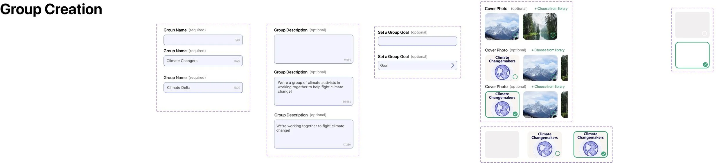
Insight: When creating a group, users were confused on requirements & the invite link easily missed
Recommendation: More defined fields & make the invite link more prominent

Revision #3
Insight: Users expected onboarding to be interactive / clickable
Recommendation: Adjust onboarding layout to maximize user understanding

Translating Design to Development
As a final step, we demoed our final designs to the entire team and helped ensure the development team had the necessary design resources to continue building out the feature in their prototype environment. We helped check for design inconsistencies with the UI and helped build success criteria for implementation tickets. As of fall 2023, the feature is currently still being developed in the live app.

Reflection
Leading the design team on this contract and collaborating with the full team was a huge learning opportunity for me. I enjoyed working with such talented designers, researchers, strategists, and developers and although it was challenging at times to find alignment and decide on a direction, we pulled through to launch a successful v1 of the feature.
Overall this experience made me excited to lead and mentor a team of designers again in the future.
